
Web Site Design, Authoring & Editing
by Christopher Long — since 1994
The following are a few examples of web site pages produced over recent years. They are included to show the possibilities that exist from simple one-frame designs to more complicated four-frame versions.
The small images here were taken from a very high resultion screen: at more typical lower resolutions the page content would fill the browser completely. This demonstrates one of the more difficult problems facing designers and their clients – how to harness the capabilities of the most advanced hardware, software and data-transmission speeds while at the same time catering to the majority of site visitors who are not so well-equipped.
In the end most designers, authors and editors are agreed that simplicity is the key to good presentation and often helps to bridge the the 'technology gap'.
It is also essential to bear in mind that few of us read a magazine twice. Site visitors may be easily persuaded or induced to visit a site once. If they like what they find there they may well visit it again. But few will visit a site a third time if they found that nothing new was on offer on their second visit.
The lesson here, when commissioning a web site, is to ensure that adequate attention is given to maintaining and evolving a site. It is usually far wiser to keep initial site creation costs low and devote more skills, resources and funds to the on-going process of keeping the site content relevant, exciting and varied.
By Christopher Long
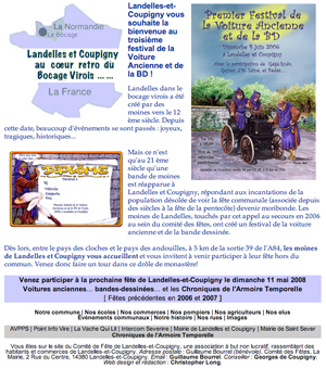
 This is the author's own site, a four-frame design which allows visitors a simple option to view pages in frames or as stand-alone documents. Founded in 1994, it is one of the longest established sites on the web. By 2002 it had also become one of the largest sites on the web to be designed, written and managed by an individual private owner.
In order to make such a large volume of pages and information accessible and user-friendly, the heirarachy is deliberately very simple and never more than three levels deep – nothing is more than two clicks from the front page.
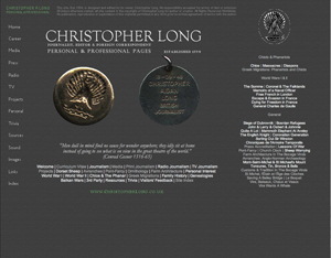 Every page can be accessed from one of around 10 indexes, arranged by category, while a variety of options allows access to all these indexes and a 'whole site index' at all times.
Importantly the front page offers a list of recommended viewing which is frequently changed in order to draw the visitor's attention to new items or pages they might otherwise have missed.
A site specific search engine, permanently available to visitors along with access to a parallel catalogue of all image and sound items on the site, was abandoned in 2006 when whole-web search engines such as Google became very efficient. At the same time CSS styling began to be introduced.
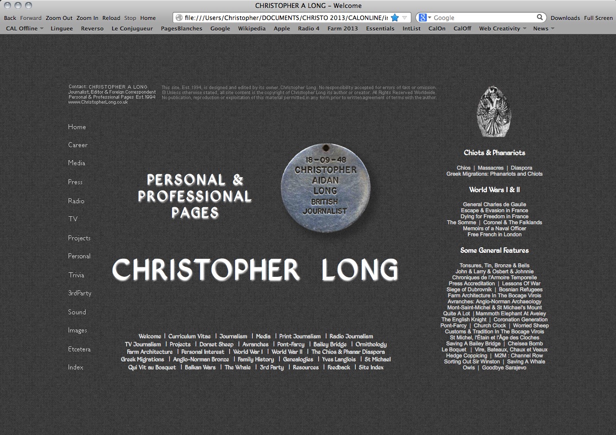 In 2010 frame-based presentation was abandoned on this site and styling was achieved entirely through HTML5 and CSS3.
 This was tweaked in January 2014 and had a emblem added to mark the 100th anniversary of WWl.
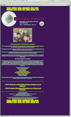 This site for the charity Crossing Borders (1998) was deliberately designed to be very simple – much like many amateur personal web sites.
The one-page presentation with lengthy scrolling was chosen because the volunteers and
children who would update and maintain it were expected to have few, if any, web skills.
The drawbacks to this approach are obvious: lengthy scrolling down the pages and slower
downloads as more images were added to each page.
However, with few pages to maintain the volunteers found this easier than trying to
become web-masters – they simply had to add-and-delete text and simple code instructions to refresh and update their pages.
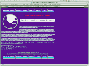 This site, created in 1998 for the charity The Fund for Refugees in Slovenia, presented the same sort of problems as with Crossing Borders above.
Again it was to be maintained by volunteers with little knowledge of the web and few resources.
The solution, again, was to keep the pages simple and adaptable – made simpler by the fact that in this case children would not be dumping their drawings and photographs all over the well-balanced and carefully thought-out page design!


N.B. Images of sites on this page represent their appearance when first designed. Most sites have evolved since then and may currently look very different from their original appearance.
© (2008) Christopher A. Long. Copyright, Syndication & All Rights Reserved Worldwide.
The text and graphical content of this and linked documents are the copyright of their author and or creator and site designer, Christopher Long, unless otherwise stated. No publication, reproduction or exploitation of this material may be made in any form prior to clear written agreement of terms with the author or his agents.


